Website Redesign: The redesigned website boosted clarity by 42%, cut task time by 89%, and was preferred by 9 out of 10 users.


PROBLEM STATEMENT
How might we redesign Megaputer's website to streamline navigation, unify its visual identity, and boost user engagement


Project Overview
Cluttered/inconsistent website, user drop off, poor user experience
Problem
Creating a design system, SEO boost, streamline navigation flow
Goal
Website Redesign
Solution
The redesign boosted clarity by 42%, cut task time by 89%, and was preferred by 9 out of 10 users.
Impact
Website Analysis
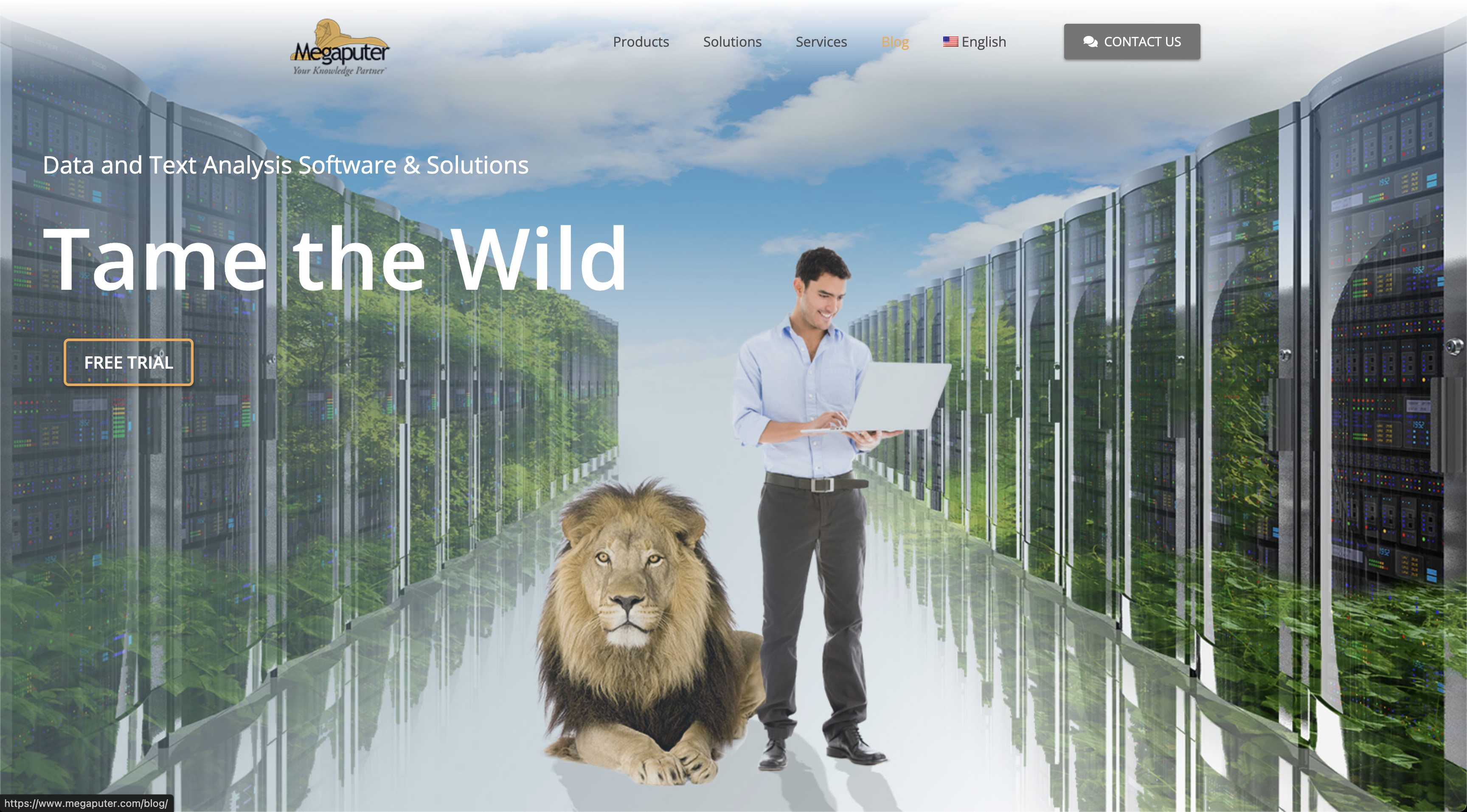


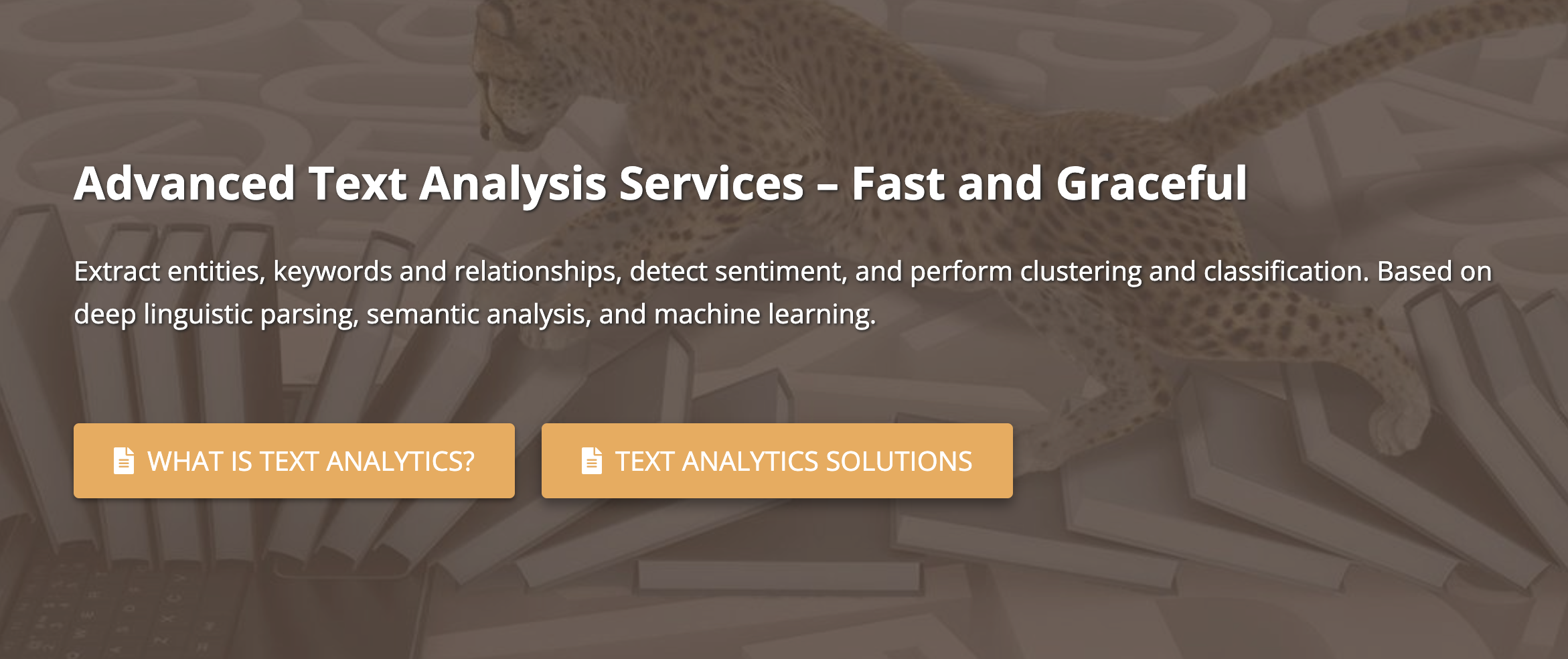
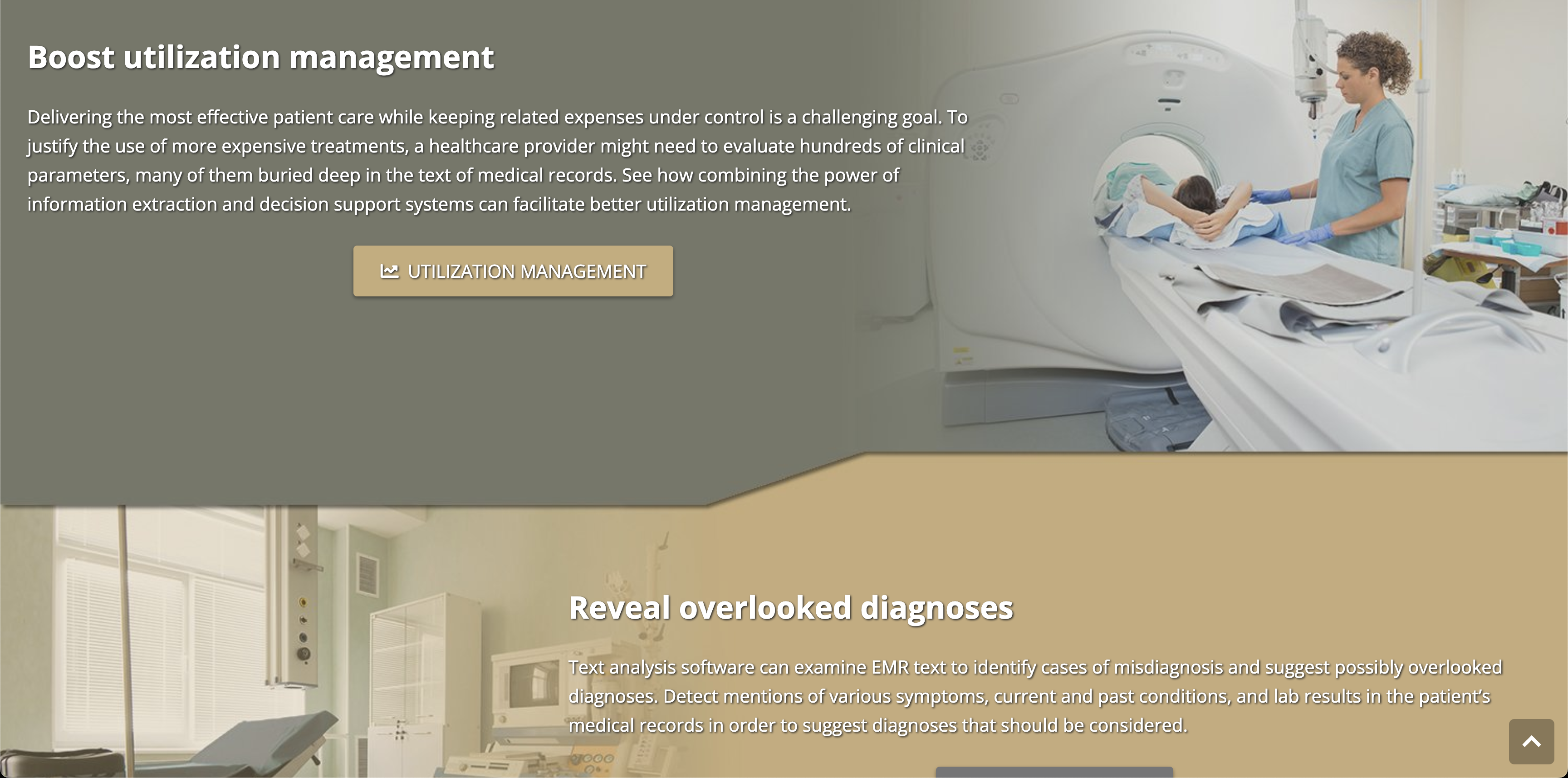
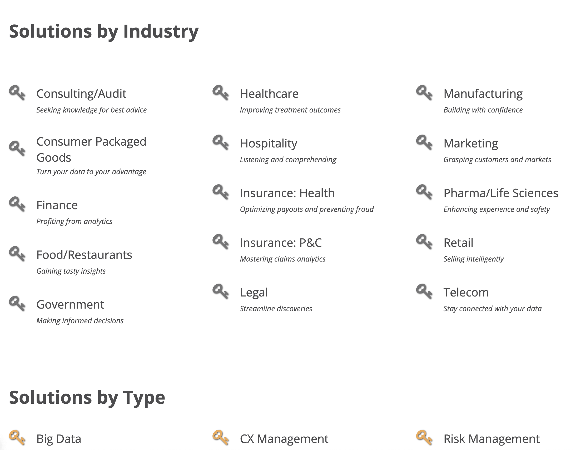

Inconsistent CTAs and icons
Image does not match what the page is about
Page primary text and tagline contrast issue+ wrong placement visually(fails eye tracking test)
Too many categories
Text heavy
CTA Fails accessibility test
Unorganized
Header contrast issue, Primary CTA in disabled color
Unrelated hero page tagline
and image
What am I solving?
User Pain Points


"Their product is very powerful, but their website was difficult to navigate through. The visuals did not help"
User Experience/ navigational flow

SEO Issues
"As a Data Analyst myself, tools like polyAnalyst from Megaputer can be a game changer, but I could not find Megaputer when I tried looking up for a product lsimiliar to theirs."

Visual Inconsistency
"In the age of digital media, a book is judged by it's cover. The visuals on the website threw me off too much. It was distracting and did not make sense in a lot of places"
#FCB913 - Primary
#FFDBAB -
Primary Light
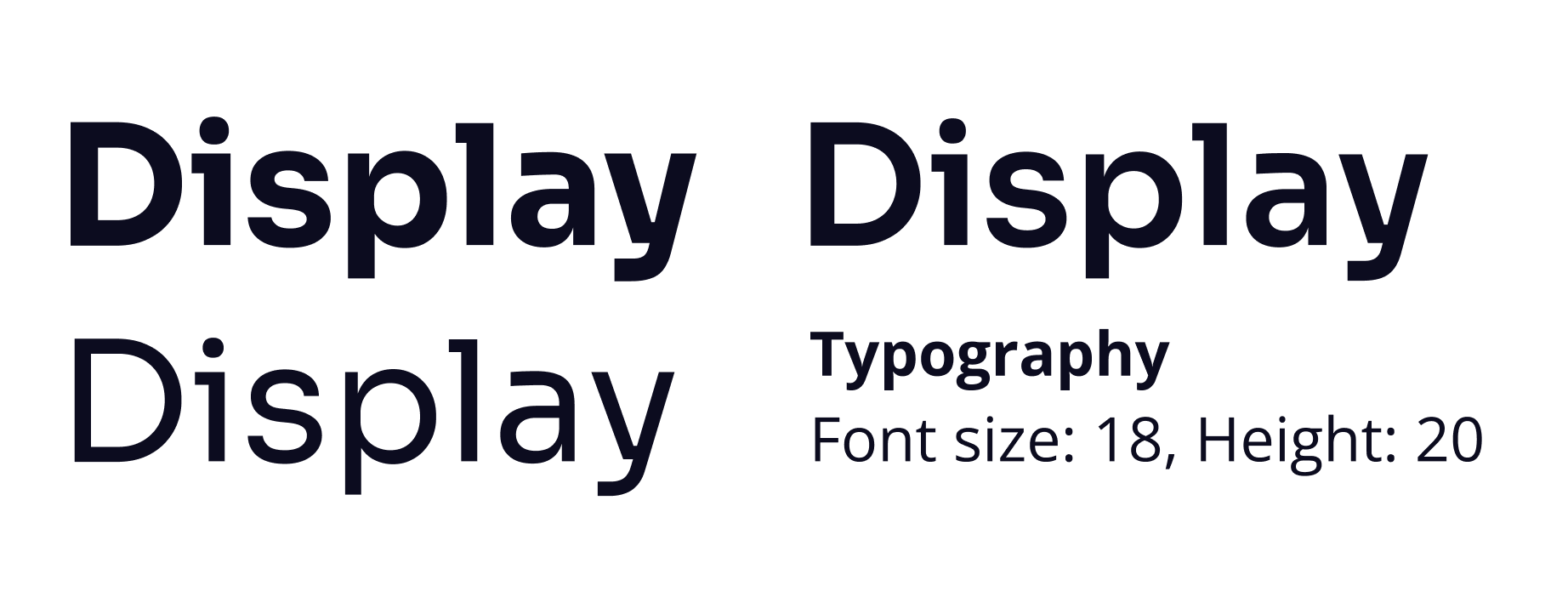

THE SOLUTION
The Design Style Guide
#2B3339 - Secondary
#374F65 -
Secondary Light
#98CBF8 - Tertiary
#C3DEF7 -
Tertiary Light
Redesiged Pages
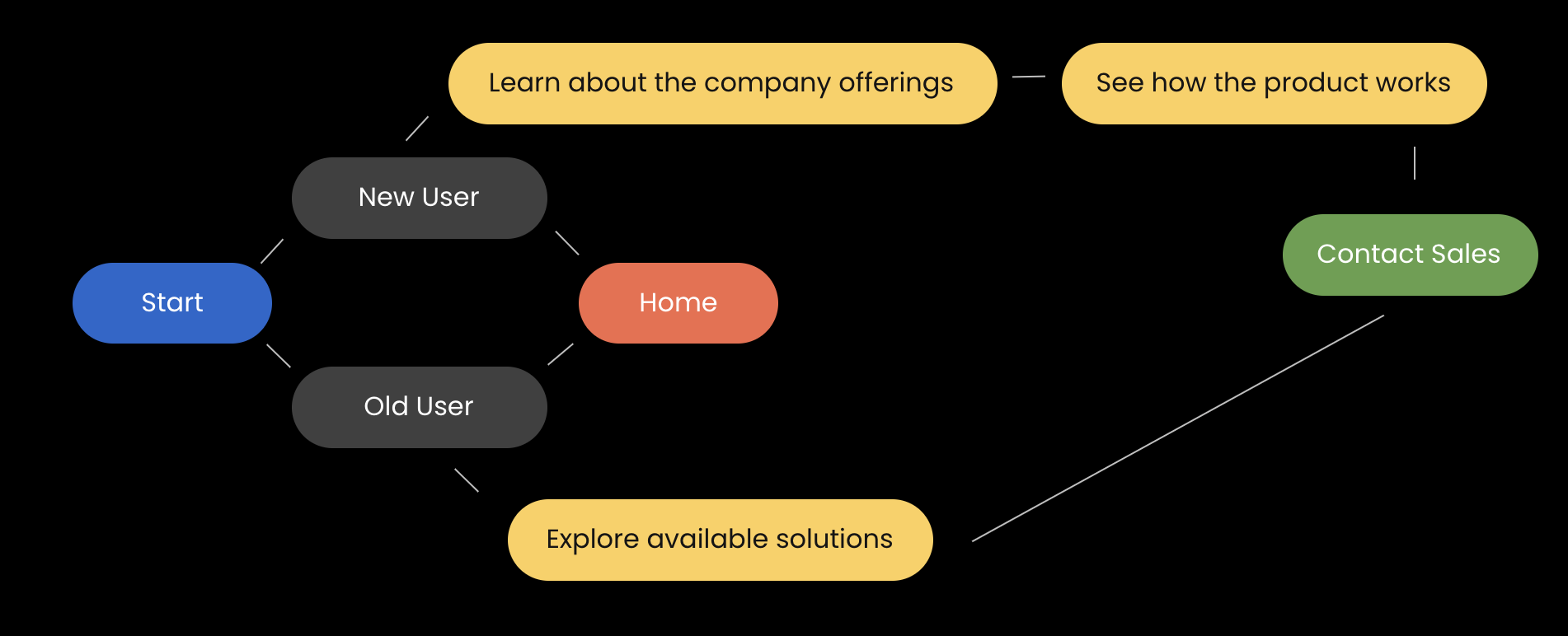
For the best outcome, we first created a Golden Flow(An Ideal flow)


Unclear imagery and tagline, failing to convey the company’s purpose effectively.


clarifies the company’s purpose and boosts credibility by highlighting partnered clients, enhancing trust.


Company offers not clearly outlined


Organized company offerings


Confusing for the user, too many options and not having any clear description of the solution


An organized interface featuring tab-based navigation, contextual tags for usability and SEO, and an impactful tagline.


Animal image on the hero section of the solutions page is misleading and the layout has too much information for the user to skim through
.png)

Redesigned layout in a readable format by having dropdowns, solution overviews, and organized sections: How it works, Impact, and Case Studies.


An easy way to understand competitors, which also highlights the value proposition of the company + Increases search engine results due to use of SEO words on home page
Additional Pages
Solution Validation


Old flow task completion- 1 min 18 seconds


New flow task completion- 30 seconds


Previous color palette failed contrast test
.jpeg)

New color palette passed the contrast test


Main Focus going towards the human and lion instead of the tagline.
.jpeg)

Focus on the tagline and the representing image, CTA and clients
Impact

-
Audited and organized a no-code website with over 207 pages to 54 pages
-
Reduced page count by over 74%
-
Redesigned user flow reduced task time from 1 min 18 sec to just 30 sec, a 61% improvement in efficiency.
Future Steps

-
Optimize remaining pages for SEO and accessibility
-
Implement internal search to improve content discoverability
-
Monitor user behavior to identify further refinement opportunities
-
Gradually roll out visual and interaction design updates across all 54 pages


